


Document Actions
gvSIG-Desktop 1.10. User Manual
Symbology
Introduction
It is a tool which allows thematic cartography to be carried out with relative ease.
You can choose the colour, mesh etc. which most appropriately symbolises or represents the data or variables of the elements to a layer.
To access the edit option of properties related to the symbology you must go to the “Properties” menu (click on the smaller button on the layer).
Another window will open, place the cursor on the “'tables of symbols' tab".
Vectorial
Legends types
Introduction
In this tab you can define, in an advanced manner, the type of legend with which you want to represent the data of layer, from its fields [1].
[1]: It must be noted that you can not use the fields resulting from a join to make legend classifications, meaning that, to use these fields in a legend you will have to export the shp resulting from the join.
You can choose the following forms of representation:
Quantities
Four types of legends can be found:
Point density
Defines a legend of a point density based on the value of a certain field.
Labelling field A drop-down menu opens where you can choose fields from the table (Double or Integer types) from which you can make a legend which represents the quantity of each value in the table. The properties of the points which represent the density of the values in the table can be changed.
- Point size: Use the arrow to change size of the point.
Point value: This is the numeric value which will be given to each point that is drawn.
- Colour: Choose the colour of the point by clicking on the button located right of the colour.
- Background colour: Choose the background colour.
- Outline: Click on this button if you want to give an outline to the symbol.
Intervals
This type of legend represents the elements of a layer using a range of colours. The gaps or graduated colours are mainly used to represent numeric data which have progression or range of values, such as population, temperature, etc.
Classification field: A drop-down menu where you can chose the attributes of the layer for which you want to make the classification for. The field must be numerical as it is a gradual classification (by the rank of the value)
- Interval type: There are three types of intervals from which to choose. These are:
- Same intervals: Calculate same intervals from values which can be found in the chosen field to make the selection.
- Natural intervals: The number of intervals are specified and the sample of this number is divided into this number according to the Jenk method of optimisation of the natural localisation of intervals.
Cuantil intervals: The number of intervals are specified and the sample is divided into this number but gathering into groups values according to their order. Number of intervals: Should indicate the rank or interval number which defines their classification.
- Nº of intervals: Type in the nº of intervals to be represented.
- Initial and final Colour: Select the colours that will be used to graduate. The initial colour for lower values and the final colour for the higher ones.
- Calculating intervals: Once the above options have been defined, click on the “Calculate intervals” button to show the final result. The default symbols and labels that appear can be modified by clicking on them, just as in the previous cases.
- Add: New ranks to the calculations can be added.
- Remove all / Remove: Allows you to delete all (remove all) or some (remove) of the elements which make-up the legend.
Graduated symbols
Represents quantities through the size of a symbol showing relative values.
- Classification field: Choose the numeric field for which the classification is to be made.
- Interval types: The same that are in legend type Intervals
- Symbol: Modify the symbol size with a minimum value (From), to a maximum value (Until). You can also modify all the features of a specific symbol by clicking on the “Template” button, as well as its “background”.
- Calculating intervals: Once the above options have been defined, click on the “Calculate intervals” button to show the final result. The default symbols and labels that appear can be modified by clicking on them, just as in the previous cases.
- Add: New ranks to the calculations can be added.
- Remove all / Remove: Allows you to delete all (remove all) or some (remove) of the elements which make-up the legend.
Proportional symbols
Represents quantities through the size of the symbol which shows exact values.
- Classification field: Choose the numeric field for which the classification is to be made.
Normalisation fields: Possibility of choosing a numerical field which normalises the results, maintaining the proportion of quantities.
- Symbol: Modify the symbol size with a minimum value (From), to a maximum value (Until). You can also modify all the features of a specific symbol by clicking on the “Template” button, as well as its “background”.
Categories
Expressions
Shows layer elements according to a certain filtered expression.
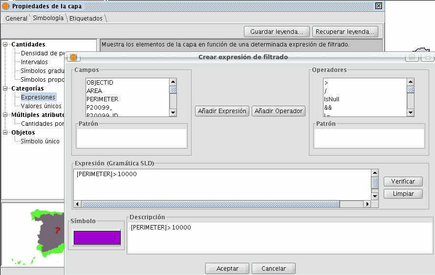
- ''New filtered expression:'' A new window opens where you can configure expressions (filters) upon which a certain symbol will be applied. Each of these will be shown as a row in the main window of this type of legend. The syntax these filters use is SLD.
- ''Modification of filtered expression:''You are able to modify an expression by selecting it.
- ''Delete a filtered expression:''You are able to delete an expression by selecting it.
- ''Up/Down buttons:'' Allows you to move the created expressions up or down so that they later have that order in ToC.
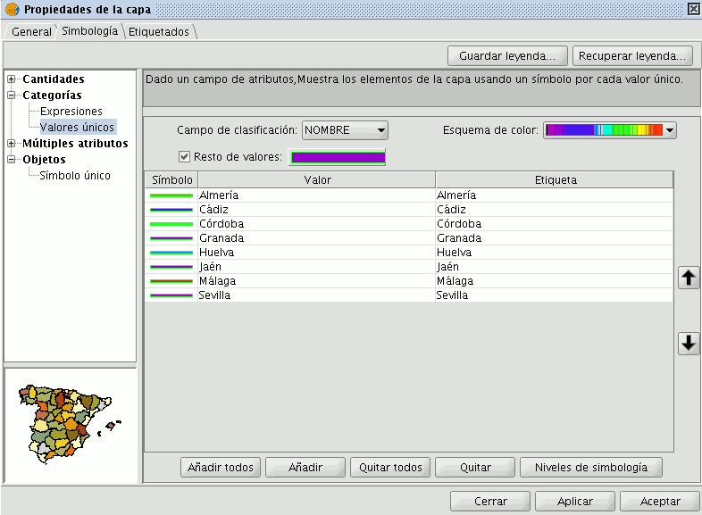
Unique values
Each register can be represented with an exclusive symbol according to the value it adopts in a certain field in the attributes table. It is the most efficient method for spreading categorical data, such as municipalities, floor types, etc.

You will find the following symbology configuration options:
- ''Classification field:''A drop-down menu opens where you can select the layer which contains the data to carry out the classification, in the attributes table field.
- ''Add all/Add:'' Once the “classification field” is selected, all the different values are shown by assigning a symbol (colour) different to each by clicking on the “Add All” button. These symbols can be modified by clicking on them. By default the label (name that appears on the legend) is similar to the value that is adopted by this field. By clicking on “Add” you can add new values to the list.
- ''Delete all/Delete:'' Allows you to delete all (delete all) or some (delete) of the elements that make up the legend.
- ''Symbol properties:'' If you right click on any of the “cells” on the “Symbols” you can modify its properties specifically through the “Select symbol” and “Symbology level” buttons, as well as being able to change the label name in TOC.
Multiple attributes
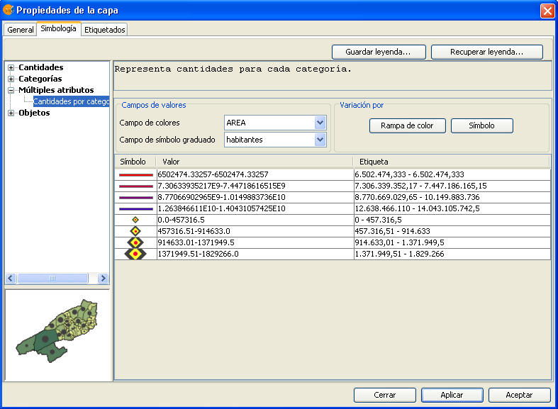
Category quantities
Represents quantities for each category.
For this, it combines two fields (which must be of a numeric type), applying a combined legend made up of colour ramp (for field_1) and specific gradual symbols (for field_2).
Meaning that this type of legend combines a a representation of intervals based on the values of Field_1 with anothier representation of gradual symbols based on the values of field_2.
Objects
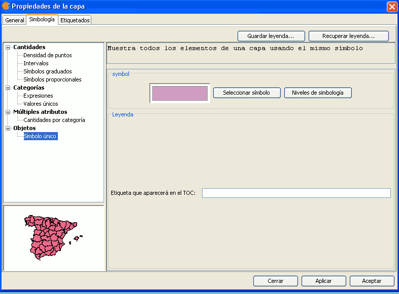
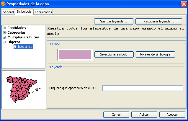
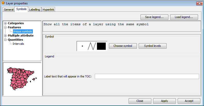
Unique symbol
This is the default gvSIG legend type.
Represents all the elements of a layer using the same symbols. It is useful for when you need to show the location of a layer more than its any other attribute. The representation of its symbology depends on the type of geometry, this is further explained in the symbols section.
Saving and recovering legends
Save legend:
The legends that have been created can be saved so that you can use them on other occasions.
To save, click on the “Save legend” button.
A window will open with the save options: save legend with gvSIV (.gvl) format or standard exchange .sld format (currently supports SDL 1.0.0).
Legend recovery:
Legends that have been previously created can be recovered at any time. Click on the “Recover legend button” and select the legend you want to recover.
Modify symbols
Introduction
The Symbols tab is used to define advanced features of the legend being worked with.
When creating symbols for a legend it is important point to bear in mind the type of layer the symbols are being created for. This is important because there are two different types of vector layers to consider when making the symbols:
- Single geometry layers: (point, line or polygon shp layers). In this case the Symbols tab allows you to create or edit symbology relevant to the geometry (lines, points or polygons), as shown below:
Single geometry layer
- Multigeometry vector layers, such as dxf, dwg, gml ...
Multigeometry layer
In this case, there is a single Symbols tab where you can configure the symbol properties of the points, lines and polygons separately. Points are configured under the Marker tab, lines under the Line tab, and polygons under the Fill tab.
Tabs corresponding to the symbols for multigeometry layers
With this clarified, we can now look at symbol properties while taking the geometry type into account.
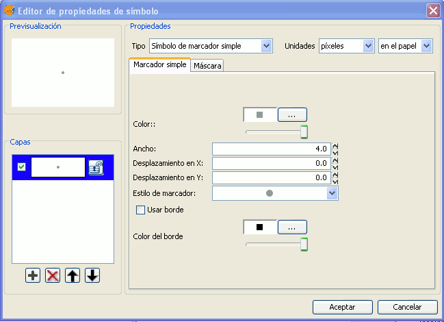
Symbol editor
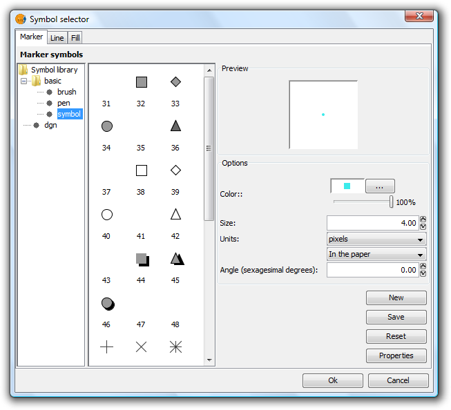
From the layer menu, in properties, you can access the Symbology section. It is possible to change or configure a new symbol clicking on “Select symbol” where you will find different configuration options.
Click on the “Select symbol” button and then on the “Properties” button. The window which opens will allow you to edit the properties of the symbol. This is the same window that will open if you click on “New”.
By default gvSIG symbolises the layers with 'unique symbols'.
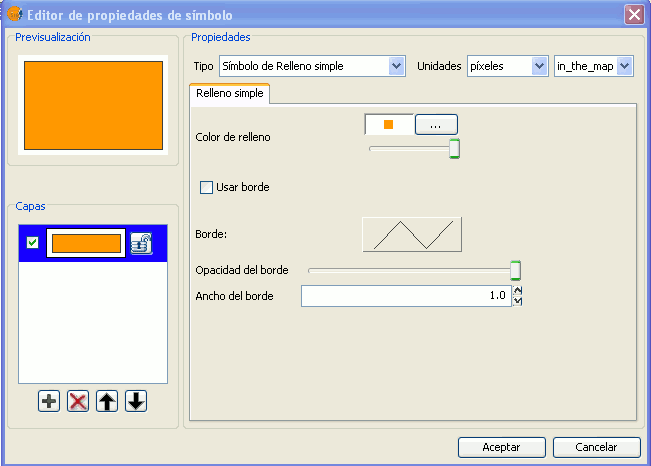
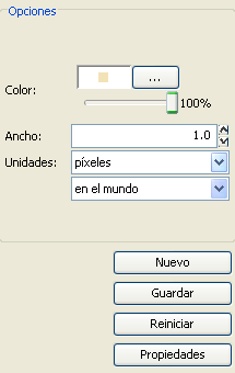
As well as the basic options that can been seen at first glance, such as colour, breadth and the type of units in which the symbol is to be represented, you can also edit the properties of the element. Next a classification of the properties of an element is made according to its geometry type.
The dialogue boxes that open have common sections and others that are specific to the type of geometry, we see them as follows:
Common characteristics:
When a symbol, is configured from its Properties, be it a point, a line or a polygon, it can be defined:
- Its colour and transparency. Allows the fill-in colour to be chosen.
Under colour you find a scrolling bar, which allows you to play with the grade of the transparency of the elements. This way, you can superimpose polygon layers without interfering with its display.
- The breadth of the symbol. Allows you to define the breadth of the element.
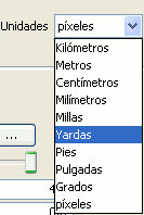
- Units: In this drop-down menu you can chose the type of unit which you want the symbol to be represented in. By default the unit which the symbol will be represented in are pixels, although you can chose between: Kilometers, meters, centimeters, milimeters, miles, yards, feet, inches, grades and pixels.
We can also specify if they are units “on the map” (the size would depend on where the zoom is set) or “on paper” (it will have a set size, both on screen and when it is printed).
- New: Access the properties of the symbols in order to make a new symbol.
- Save: Allows you to save the symbols you have created in gvSIG's library of symbols, with a .sym extension, in order to be able to use them as often as you need and also to configure different types of legends.
- Restart: Click on this button if you wan to restart the editing of a symbol.
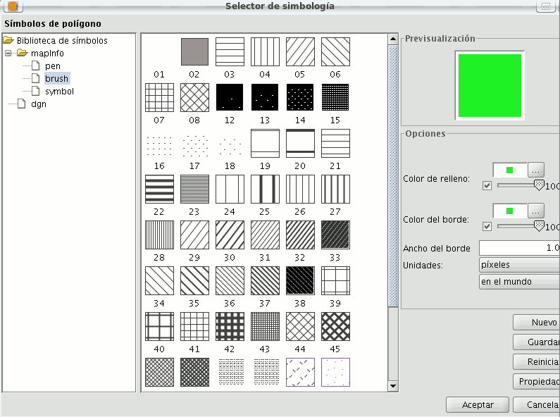
Specific characteristics of each type of geometry:
Symbol type:
| Mercator | Lines | Fill-in |
|---|---|---|
| Of character | Simple line | Simple fill-in |
| Simple mercator | Mercator lines | Image fill-in |
| Mercator image | Line image | Mercators fill-in |
| Of character | Simple line | Line fill-ins |
| Of character | Simple line | Gradient fill-ins |
The mercators represent the layers of the points.
The lines represent the linear layers.
The fill-ins represent the polygon layers.
All three together represent the multi-geometric layers.
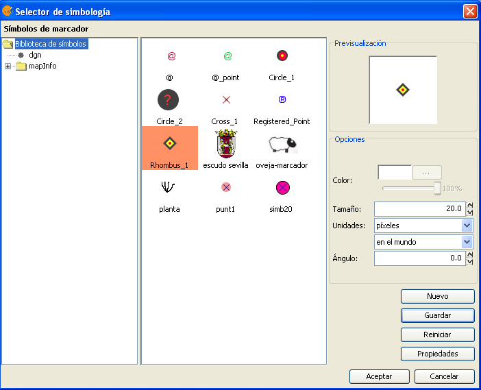
You can chose between different Markers that are shown in “Type of Marker”.
Simple Marker:
In “Marker style”, select the marker (circle, square, cross...). You can modify its size, angle and colour as well as being able to move it around the ordinate and abscissa axis.
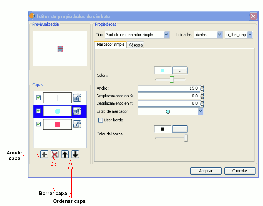
Marker made up of simple markers: you can make up a marker from various other simple markers by “overlapping” one over the other, this is done by clicking on “add layer”, where each layer is a simple marker. You can delete or change the order of the layers by clicking on “Delete layer” or “Tidy layers”. In the following image there is an example of a symbol made up of various simple markers.
You can make the symbols stand out by choosing the colour of the outline and giving it the same transparency as the fill-in of the symbols. To give the symbol an outline you must check the “Use outline” box. You can move the symbol around the ordinate and abscissa axis or leave it in the centre.
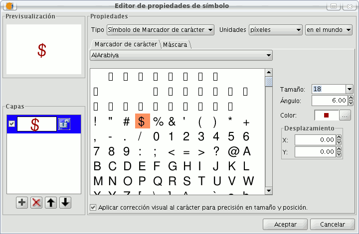
Character marker:
You can use the different alphanumeric character types to create a symbol, you can modify its size, angle and colour as well as being able to move it around the ordinate and abscissa axis.
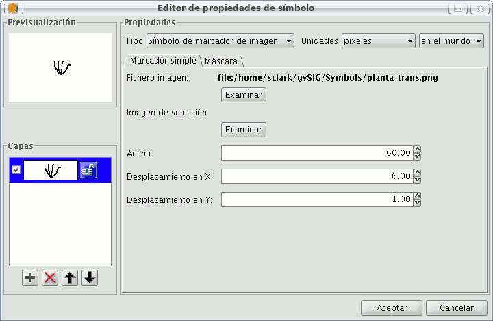
Picture marker:
You can chose whichever image you want to represent the symbol. This image can be in different formats (jpg, png,bmp, svg..., you can even download an image from the internet, as long as the format is supported by gvSIG). To add it just select the path where the image is saved by clicking on “Examine”, next to "Image file".
Also, you have the option of selecting a different image, which is to represent the geometries, when they have been selected and are in view. Do this by entering the path of the image in "Selected image".
You can move the symbol around the ordinate and abscissa axis or leave it in the centre.
You can choose between different Mercator that are shown in the “Mercator type”.
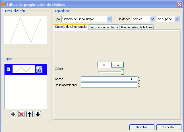
Simple line symbol:
You can choose the colour of the line, its breadth and its movement (offset), as well as having the option to modify its opaqueness and, of course, its measurement units.
As well as that the layers of the points can make up one line with various lines “overlapping” using the same method than which in the layers of points.
In the “Line properties” tab you can generate different types of lines, continuous lines which gvSIG has as default, or discontinuous lines, establishing the fill-in pattern you choose. For this a rule is made available from which you can design your own patterns.
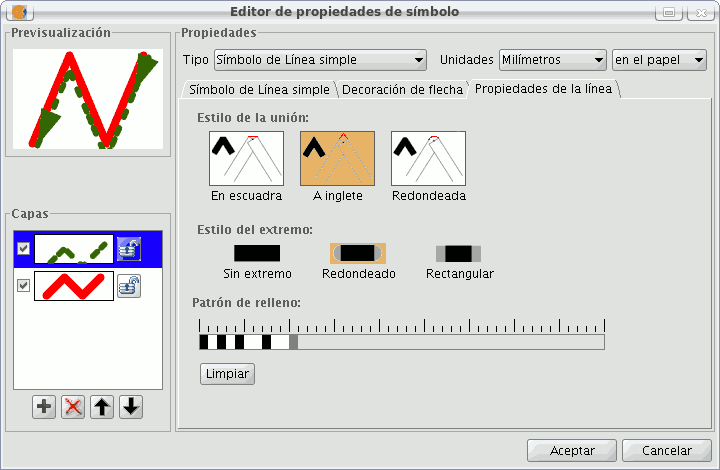
- Fill-in pattern:
Click on the grey section which is on the rule and drag right, next click on the rule, in the rule section you want, and a black section will appear which you can eliminate if you “click” on it again. This way you can successively add sections which can design your line.
If you want to delete the designed line click on “clean”.
- Boarder style: You can chose between round, rectangular or none for the boarder style.
- Style of the union: You can chose between square, angles and rounded for the union of the lines.
In the “Arrow decorations” tab you can turn a line into an arrow. To make this happen check the “Use decoration” box.
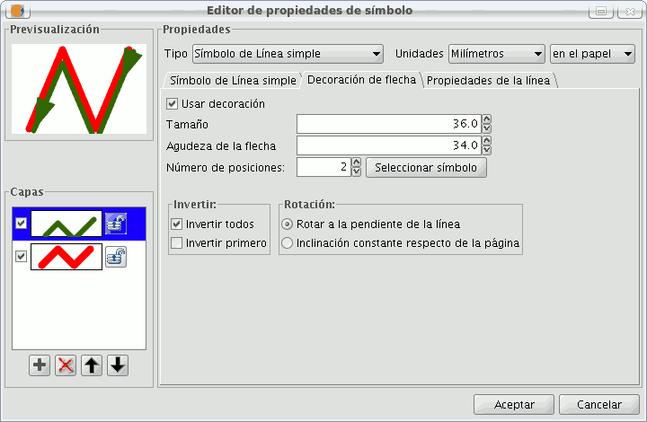
The options available to decorate the arrow are:
- The size of the arrow.
- The sharpness of the arrow.
- Nº of positions: Number of times you want the “point” of the arrow to be repeated along the line.
- Choose Symbol: This button will take you the simple Mercator of a layer of points menu, here you can select the shape of the arrow “point” and configure it as if it were any other symbol.
- Reverse: You have the option of reversing the first or all the arrows from the line.
- Rotation: You can chose between the “point” of the arrow rotates according to the slope of the line or that it has a permanent inclination according to the page.
Mercator line symbols:
You can use different font types, such as characters, to create a symbol, modifying its breadth and separation.
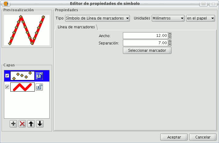
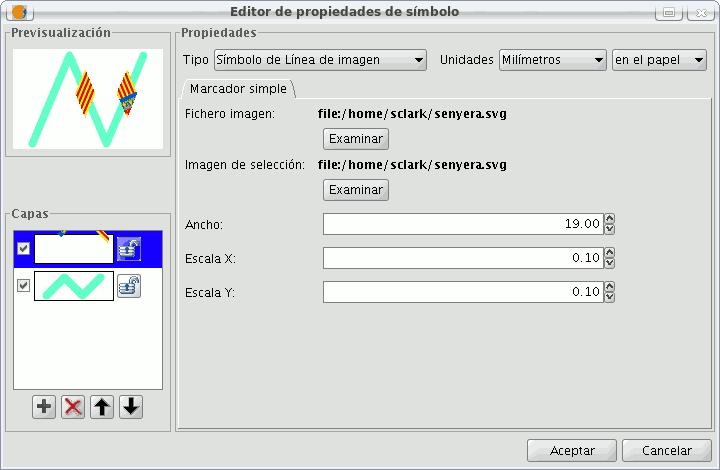
Image line symbol:
You can chose the image you want to make up the line, this image can be in different formats (jpg, png, bmp, svg...). To add the image you only have to select the path to where the image is saved by clicking on “Examine”. You can set the breadth and scale the image in “X” and “Y”.
The following fill-in Types for polygonal geometry layers are available.
Simple fill-in:
You can choose the polygon fill-in colour and its opaqueness.
Click on the button where you can see the outline and the simple symbol of a line properties menu will open. Here you can configure the outline of the polygon as if it were a line.
You can give the outline the breadth and opaqueness you want.
Fill-in made up of simple mercators: You can make up a fill-in from various simples by “overlapping” them, it is the same method as that which is explained in the layers of points and lines.
Mercator fill-ins:
You can give the polygon a fill-in made up of different types of mercators, such as punctual, linear, image... with their own characteristics.
The fill-in can be organised in an aleatory way or in a regular mesh way.
There is the option to make compositions with various layers.
Line fill-in:
Instead of filling the polygon in with specific mercators you can do so with lines, you can give them the same properties that you gave a line layer, including the outlines.
As in all sections, here you can also create a composition through different layers.
Image fill-in:
You can fill-in the polygon of images and set their inclinations by indicating the angle and you can also scale them.
The way to fill-in the polygon of images is by giving them the specific route to the image. These images can be framed, click on “Outline” and select the line you want.

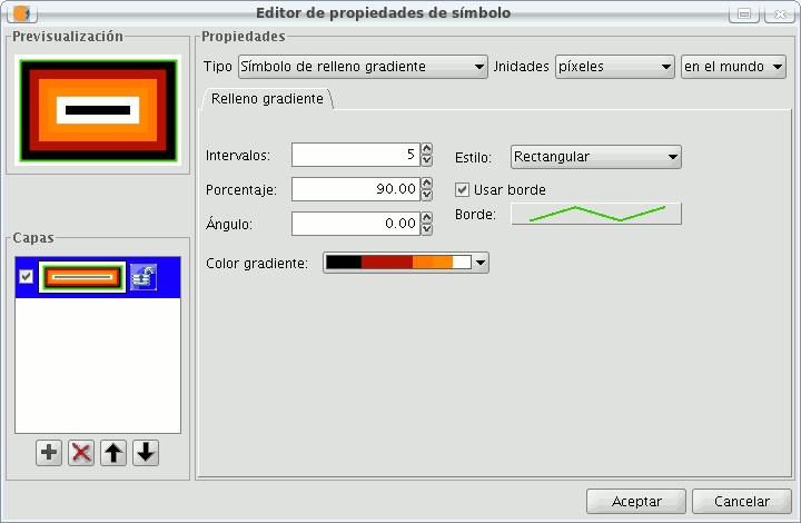
Gradient fill-in:
The possibility of gradually filling-in is available, you can select different options to configure the gradual scale of the colour, these options are:
- Intervals: Nº of intervals you want the gradual changing of the colour to be structured by.
- Percentage: You can chose to set the percentage of gradual change between 0 and 100%.
- Style: Select the style that you want for the fill-in from the drop-down menu.
- Angle: Angle of the fill-in colour.
- Colour gradient: Select the colour scale you want.
- Outline: Give the ploygon an outline, the process of this is the same as if it were a line.
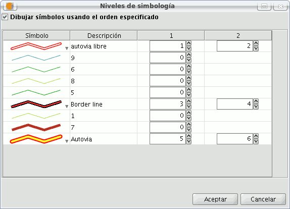
Symbol levels
As you can see in the following image, a symbol has two buttons that configure it, “Select Symbol” where you can define its properties, and “Symbology Levels” which allows us to establish the exact order the different layers has created the symbol.
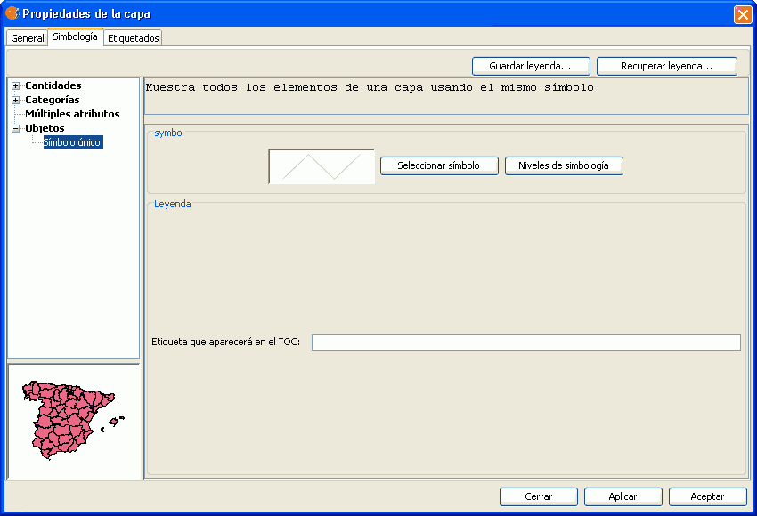
It is important to establish an order when different geometries of the same layer intersect, as can be the case in the unique Value of legends for line layers, for example, where the order established could be of interest so that some symbols are above others.
“0” value corresponds to the symbol drawn at that bottom, “1” is drawn above that and so forth successively.
Labels that show in ToC
You can give whatever name you want to the different legend values, to see them in the Table of Contents.
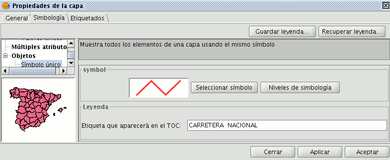
In the previous image we saw a legend by a unique Symbol, but it is also possible to give each of the legend values a label name by Interval, unique Value, etc. (or modify it, from each of the text boxes), as well as being able to modify the order with which theses values appear in ToC (throught the up/down arrows):
Library of Symbols
Upon installing gvSIC a folder called 'Symbols' is created in the user directory, here you can save different types of symbols (punctual, linear, polygonal...). In other words, it works as a library of symbols. Also, gvSIG includes, by default, a set of symbols from each type of geometry, saving them in the above mentioned folder.
Once a symbol is created, from the “Symbology select” menu, click on “Save”.
A window will open, allowing you to save the symbols on a specific route, inside the “Symbols” folder.
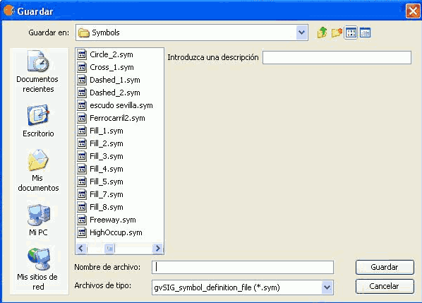
Name the symbol and click on save. Make sure you have saved the symbol as a .sym file and that when you open another layer of the same type of geometry, the library of symbols which has been saved appears.
Raster
Color tables or gradients
The Colour table interface allows users to assign specific RGB values to a range of pixel values in a single band image. It is important to note that the input image can only have one band because if there are multiple bands, each of the bands will have colours associated with it. With the colour table functionality, users can build new tables or gradients, or modify existing ones.
The colour table dialog can be launched from the toolbar by selecting the option "Raster layer" on the left drop-down button and "Colour table" on the drop-down button on the right. Make sure that the name of the layer for which you want to build colour tables is set as the current layer in the text box. The "Colour table" option will only be available if a single band image is selected.

Colour table icon
To use this function, it is important to know the minimum and maximum values in the image. If these values are unknown, they will have to be calculated. Depending on the size of the image, this calculation process may take some time. When the Colour table dialog is launched for an image that does not have any colour tables associated with it, all components will be inactive. To get started, we need to tick the check box labelled "Activate color table".
Description of components
The colour table dialog is divided into several parts:
- The central part, which covers most of the dialog, displays the legend associated with the image in tabular or gradient form. (You can switch between table and gradient view by clicking on the tabs.)
- In the lower part are the controls with settings for the tabular and gradient view.
- A preview window is located in the upper right corner of the dialog. Here we can preview the output results before they are applied to the image.
- The library in the lower right corner lists the predefined colour tables. From this list, you can choose a colour table to apply to the image. It is also possible to create a new colour table and add it to the library for future use.
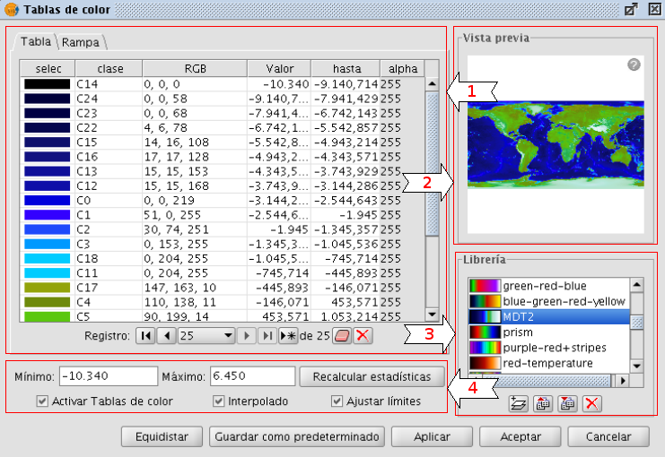
Colour table dialog - Table tab
Tabular view
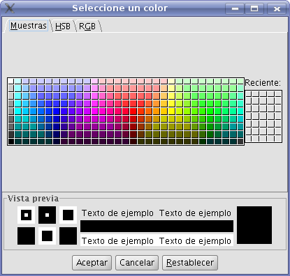
Every row in the table corresponds to a range of pixel values and its associated RGB colour. The column Value shows the first value of the range and the column To shows the last value of the range. These values can be edited directly by double-clicking on the cell and typing a new value. The RGB column contains the RGB value to be assigned to the range of pixel values. The cells in this column are not editable, but if you want to change the colour you can go to the corresponding cell in the Colour column and click on it. A generic java colour selection dialog will appear where you can modify the colour by changing the RGB values or visually.
Colour selection
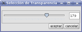
The Class column contains associated labels that will not have any effect on the calculation and are just meant to add descriptive names to the range of values. If there is any text in this column, it will be displayed in the map legend when this is created. The last column labelled Alpha shows transparency values. When clicking on the values, a transparency selection dialog will open.
Apply transparency
To manage the rows of the table (add, delete or move) you can use the general table controls located below the table (see the table control description).
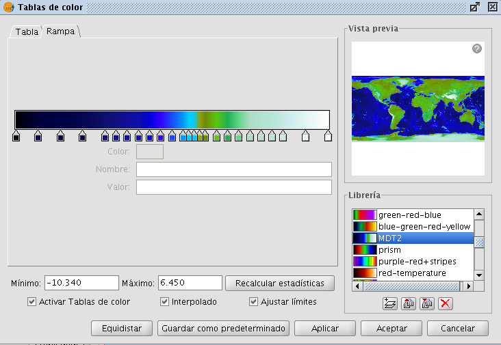
Gradient view
The gradient view (which can be accessed by clicking the gradient tab) contains the same information as the tabular view but presented in a different way, and with the possibility to obtain results that are difficult to achieve with the tabular view. The colour bar represents the range of values from minimum on the left to maximum on the right. At the start, the end and on intermediate points on the colour bar are a number of break points with a fixed colour value.

Break point
These break points indicate the colour that will be assigned to the value that falls on that point. A click on a break point will activate the text boxes below the colour bar. These text boxes show the following information about the selected break point:
- Colour: The colour of the break point (which can be modified by clicking on it)
- Class: Label associated with the point. This is the same associated label as in the Class column of the tabular view.
- Value: Pixel value at this break point.
To add a break point, just click below the colour bar. After adding a break point you can modify its information. To remove a break point you can click on it and drag it away.
Colour table dialog - Gradient tab
The final result of the gradient will depend on whether the check box labelled as "Interpolated", located below the gradient tab, is ticked or not. This option is available both in the tabular view and the gradient view. When ticked, the transition between one break point colour and the next colour will be gradual. If it is not ticked, the transition will be abrupt. The point where one colour ends and the next colour begins is marked by a diamond-shaped symbol.

Cutoff point
This cutoff point can be moved to the right or the left by clicking and dragging it.
General controls
In the lower part of the dialog are the controls for the tabular and gradient view.
- The text boxes labelled "Minimum" and "Maximum" indicate the minimum and maximum values of the image. We can recalculate these values with the button labelled "Recalc Statistics".
- The check box labelled "Activate colour table" is used to enable or disable the use of colour tables for the current layer.
- Ticking the check box labelled as "Interpolated" will result in a smoother transition between the colours of two ranges of pixel values. This means that instead of assigning a fixed colour to the whole range of pixel values, the RGB colour value of the intermediate pixel values will be the result of an interpolation of the first colour in the range, the last colour in the range and the relative position of the pixel value. If you disable this check box, the transition between colours will be abrupt.
- The check box labelled "Limits adjust" is used to adjust the ranges to the maximum and minimum values of the image. If this is turned off, the colour table will be applied to the whole range of values which is 0 to 255 by default.
- Clicking the button "Middle distance" will result in break points that all hold the same distance between them (they will be equally spread over the colour bar). The first and last values of the range of pixel values will be modified accordingly in the tabular view.
- When clicking the button "Save as Default", the current colour table will be set as the default colour table for this image. The colour table information will be saved as a metadata file (.rmf) with the image, and the next time that the image is loaded in a gvSIG view it will have this colour table associated with it by default.
Library of colour tables
gvSIG provides a list of predefined colour tables to which you can add others that you have built yourself. Located at the lower right part of the Colour table dialog, the colour table libary allows users to scroll through and manage colour tables. The list of colour tables can be displayed in three ways: List, SmallIcon and LargeIcon. The type of display can be changed by right-clicking on the list, after which a drop-down menu appears where you can select the display mode.
List:
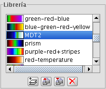
Colour table library - List display mode
SmallIcon:
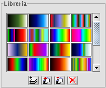
Colour table library - SmallIcon display mode
LargeIcon:
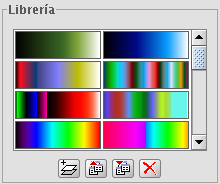
Colour table library - LargeIcon display mode
Below the colour table library are buttons to add, export, import and delete colour tables
- When clicking on the button with the tooltip "New library", a dialog opens which prompts for basic information of the colour table: the name, minimum value, maximum value and the intervals. The default minimum and maximum values are 0 and 255. In principle there is no need to change these values because the colour table is automatically set to the value range of the image to which it is applied. The intervals can be specified by two different methods. The first method is by defining an interval of values, after which the number of intervals is calculated for the whole range of values. The second method is to specify the number of intervals, after which the size of the intervals is calculated automatically.
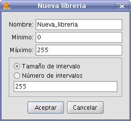
Create new colour table
- To remove colour tables press the button with the tooltip "Delete library". You will be prompted for confirmation before the selected colour table is deleted.
- You can export a colour table in one of the supported formats. Currently, only .rmf y .ggr y .gpl of Gimp are supported.
- You can import a colour table in one of the supported formats. Currently, only .rmf y .ggr y .gpl of Gimp are supported.
Legend in the view and map
The colour table built with this tool will classify the image in ranges of data values. When accepting the colour table dialog settings, this classification is shown in the TOC just below the layer name. For each colour, the corresponding range of values and the associated label, if any, is shown as a legend.
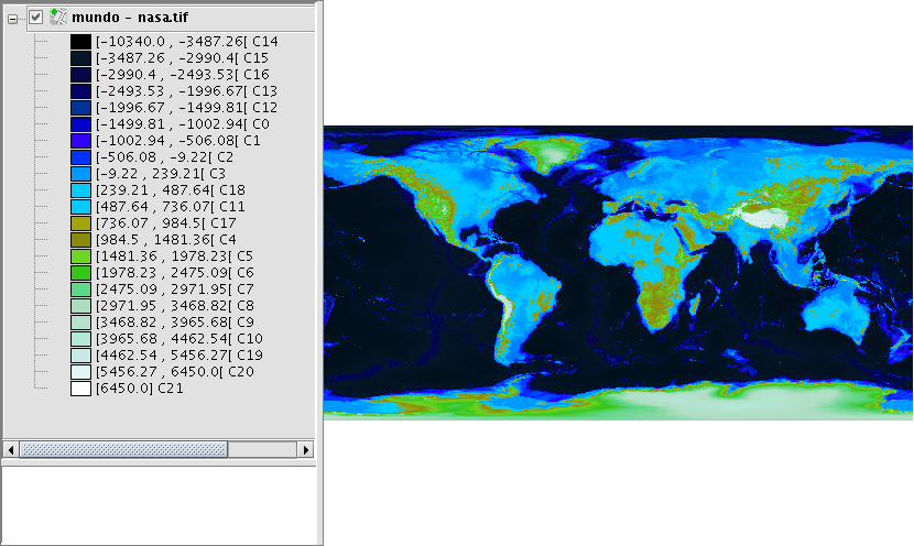
Legend in the ToC according to the colour table of the image
The generated legend can be inserted when preparing a map.
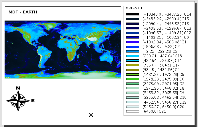
Map with view and legend inserted


